Good Living Studio is where Jeremy Grant designs digital products and branded experiences for tech, commerce and culture. Recent work includes enterprise rebrands for Lenovo, Microsoft and JBL, and the design of Stagwell’s agentic operating system, The Machine.
Selected work
Good Living Studio is where Jeremy Grant designs digital products and branded experiences for tech, commerce and culture. Recent work includes enterprise rebrands for Lenovo, Microsoft and JBL, and the design of Stagwell’s agentic operating system, The Machine.
Selected work
Good Living Studio is where Jeremy Grant designs digital products and branded experiences for tech, commerce and culture.
Recent work includes enterprise rebrands for Lenovo, Microsoft and JBL, and the design of Stagwell’s agentic operating system, The Machine.
Selected work
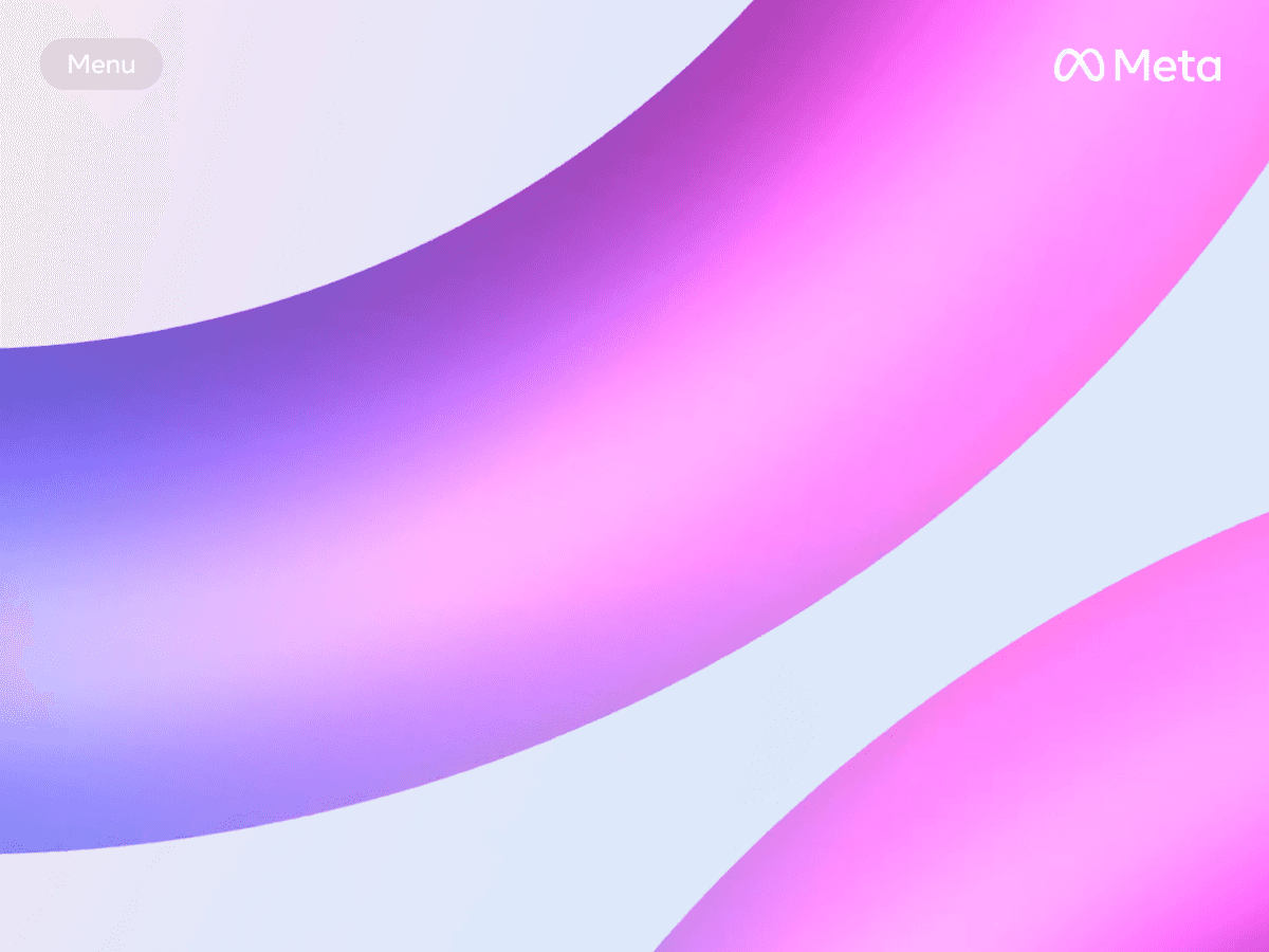
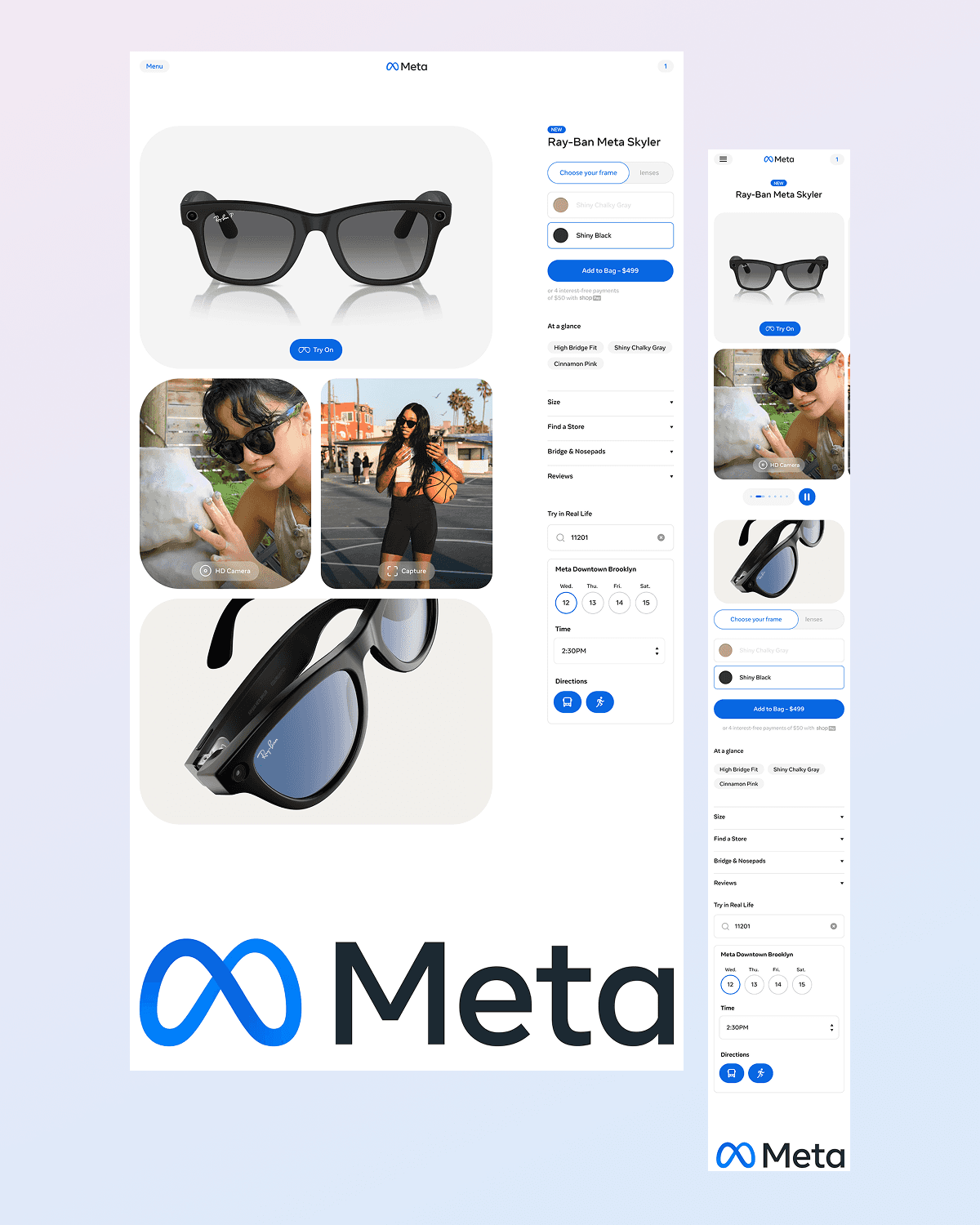
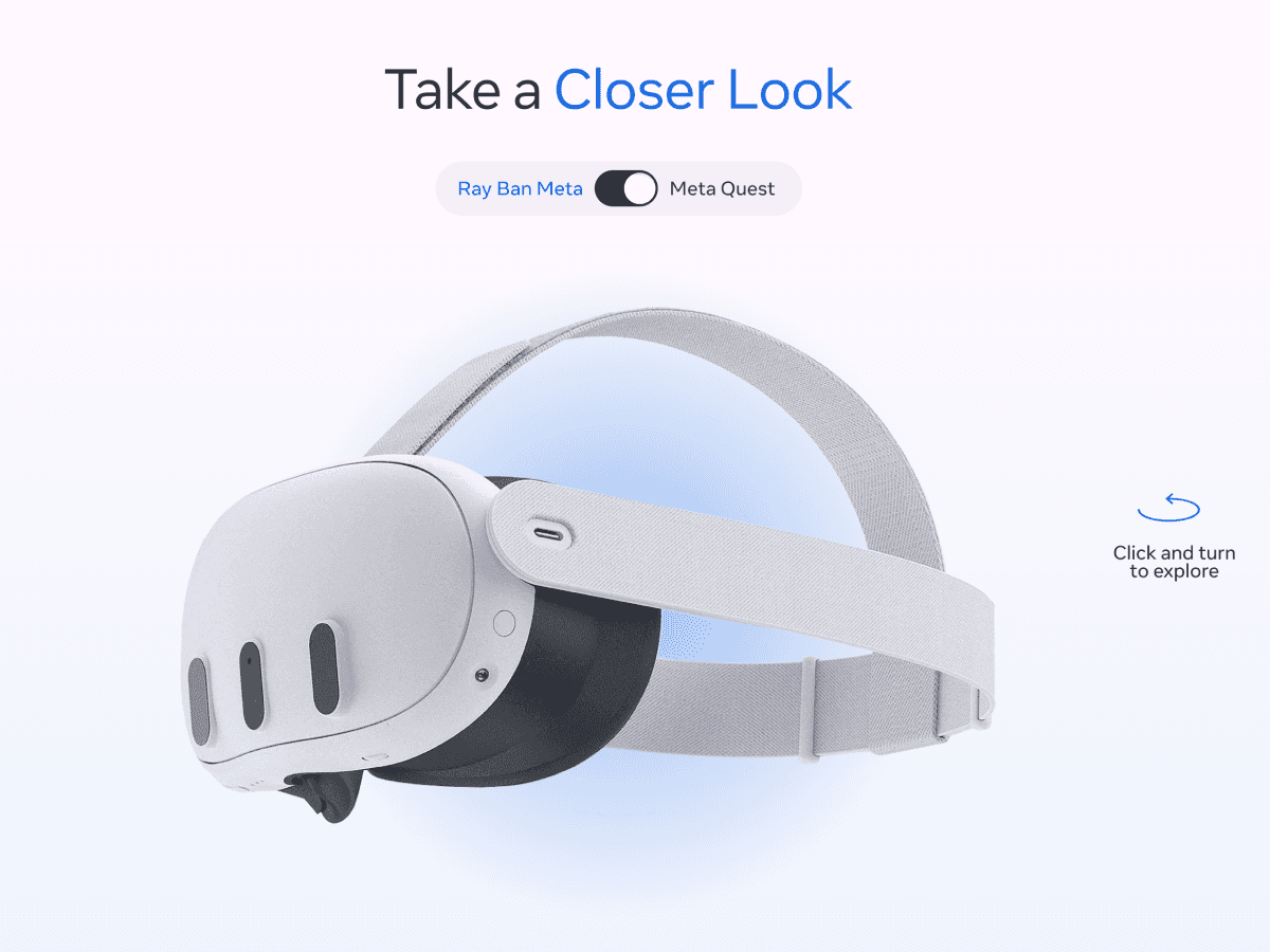
Meta
,
E-Commerce
,
2023
Meta approaches commerce differently than most brands. Rather than treating their digital storefront as a point of transaction, they see an opportunity to position themselves as a gateway into emerging forms of connection—introducing people to the possibilities of things like AR, VR and emerging tech before asking them to buy. Leading design, I guided the experience away from feature comparison and toward exploration, reframing products like Meta Ray-Ban and Meta Quest as entry points into new modes of seeing, sharing, and interacting. The work focused on shifting users out of a pro-and-con mindset and into a space of curiosity and imagination. Meta.com was designed as an immersive journey—one that helped users understand what these technologies could mean in their own lives, while connecting seamlessly into Meta’s broader retail and post-purchase ecosystem. To support this shift, I led the development of an engagement framework structured around five progressive stages: See it, introducing relatable use cases; Feel it, personalizing experiences to individual contexts; Dream it, clarifying value and reducing friction; Share it, integrating creator and community perspectives; and Do it, optimizing activation and conversion. This structure allowed inspiration and commerce to work in concert rather than in tension. The resulting platform aligned brand expression, storytelling, and performance into a cohesive system—one that encouraged return, supported long-term engagement, and positioned Meta.com not simply as an e-commerce destination, but as a dynamic hub for discovering the future of digital interaction. - Credits: Jeremy Grant, Design Director Roman Koscianski, Design Ibrahim Noon, Motion
Meta_01.png
Meta_02.mp4
Meta_03.png
Meta_04.png
Meta_05.mp4

Meta_06.png

Meta_07.png
Meta_08.mp4
Meta_09.png
Meta_10.mp4
Meta
,
E-Commerce
,
2023
Meta approaches commerce differently than most brands. Rather than treating their digital storefront as a point of transaction, they see an opportunity to position themselves as a gateway into emerging forms of connection—introducing people to the possibilities of things like AR, VR and emerging tech before asking them to buy. Leading design, I guided the experience away from feature comparison and toward exploration, reframing products like Meta Ray-Ban and Meta Quest as entry points into new modes of seeing, sharing, and interacting. The work focused on shifting users out of a pro-and-con mindset and into a space of curiosity and imagination. Meta.com was designed as an immersive journey—one that helped users understand what these technologies could mean in their own lives, while connecting seamlessly into Meta’s broader retail and post-purchase ecosystem. To support this shift, I led the development of an engagement framework structured around five progressive stages: See it, introducing relatable use cases; Feel it, personalizing experiences to individual contexts; Dream it, clarifying value and reducing friction; Share it, integrating creator and community perspectives; and Do it, optimizing activation and conversion. This structure allowed inspiration and commerce to work in concert rather than in tension. The resulting platform aligned brand expression, storytelling, and performance into a cohesive system—one that encouraged return, supported long-term engagement, and positioned Meta.com not simply as an e-commerce destination, but as a dynamic hub for discovering the future of digital interaction. - Credits: Jeremy Grant, Design Director Roman Koscianski, Design Ibrahim Noon, Motion
Meta_01.png
Meta_02.mp4
Meta_03.png
Meta_04.png
Meta_05.mp4
Meta_06.png
Meta_07.png
Meta_08.mp4
Meta_09.png
Meta_10.mp4
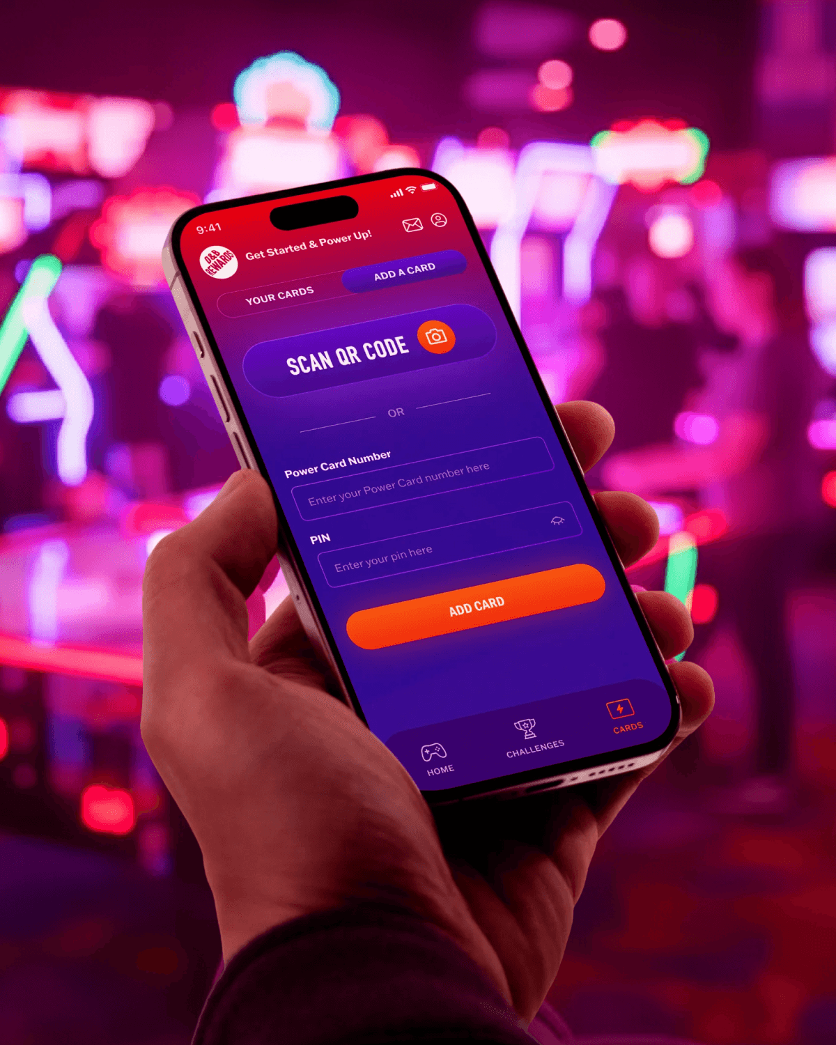
Dave & Buster's
,
App
,
2021
Dave & Buster’s is a neon-lit, high-energy world of competition, camaraderie, and celebration—one that thrives on immediacy, spectacle, and social play. Translating that experience into a digital loyalty and food-ordering platform posed a specific challenge: how to create a mobile product users would return to between visits without flattening it into a purely transactional tool. The opportunity was to treat the app not as a companion, but as an extension of the arcade floor itself. Leading the UX and visual design of the loyalty and food service apps, I worked to evolve the digital ecosystem in alignment with the brand’s existing identity while adapting it to the constraints and expectations of product design. The work focused on creating a system that could support scale and clarity while still carrying the energy of competition and reward. Rather than relying on surface-level theatrics, the experience was structured around progression, feedback, and momentum: principles already central to gaming culture, but underutilized in loyalty platforms. A custom badge system, motion language, and reward framework were developed to make achievement legible and motivating over time. Interactions emphasized continuity—tracking progress, surfacing milestones, and reinforcing return behavior—so that users felt a sense of advancement even outside the physical space. The resulting product balanced operational efficiency with experiential intent, translating the spirit of play into a durable digital system that supported both business goals and brand authenticity. - Credits: Jeremy Grant, Design Director Hudson Paine, Design Sterling Rose, Design Carmelo Ragona, Motion
DNB_01.mp4
DNB_02.mp4
DNB_03.mp4
DNB_04.mp4
DNB_05.mp4
DNB_06.png
DNB_07.mp4
DNB_08.mp4
DNB_09.mp4
DNB_10.mp4
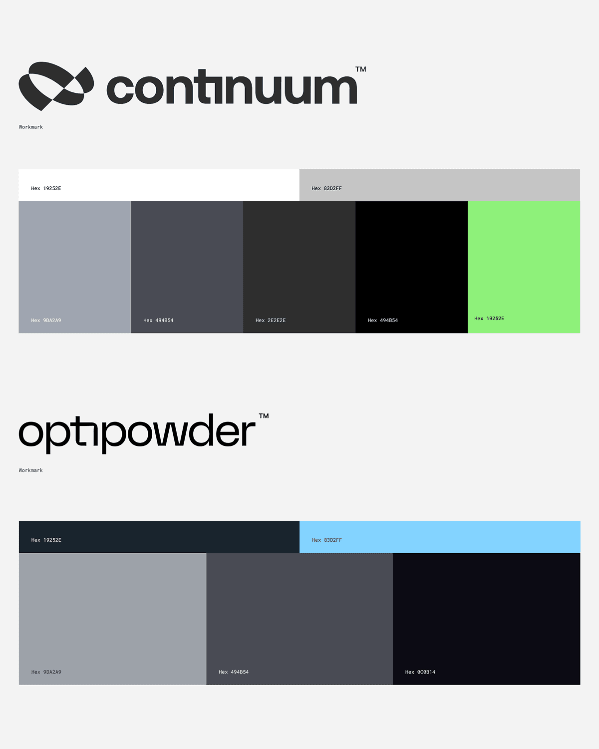
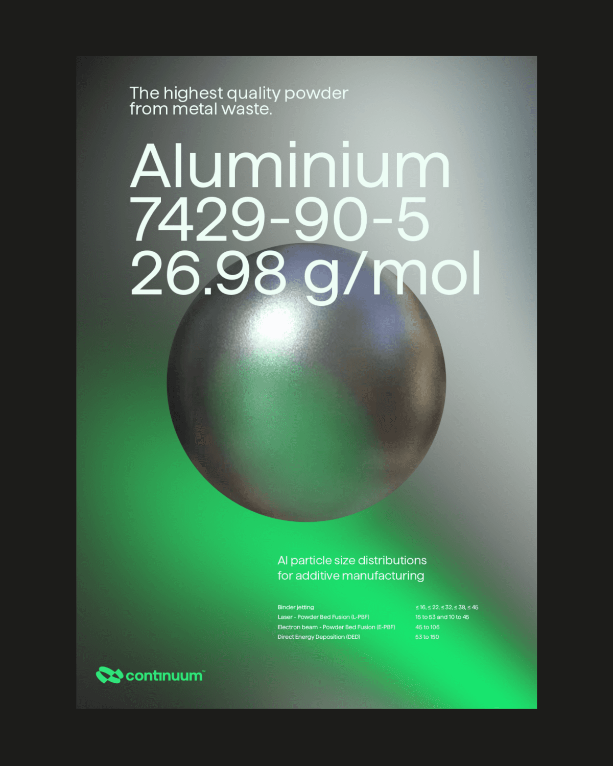
Continuum
,
Brand
,
2022
Continuum Powders is advancing a new model for manufacturing—one that transforms recycled metals into high-performance powders for industries where precision, reliability, and scale are non-negotiable. From the outset, the opportunity was to introduce a new materials company into an emerging but competitive landscape and define how sustainability could operate as a strategic advantage in sectors shaped by legacy processes and conservative thinking. Leading the brand from inception, I oversaw the development of Continuum’s name, identity system, messaging framework and digital presence—shaping a cohesive expression that balanced technical rigor with environmental responsibility. The work centered on translating complex engineering into a clear, compelling narrative without diluting its substance. A brand architecture was designed to ground Continuum’s circular manufacturing model while signaling credibility at an industrial scale. The visual system drew on elemental forms and kinetic structures—expressing transformation, momentum, and continuity—while the messaging positioned sustainability not as a concession, but as a performance multiplier. Rather than framing Continuum as an alternative, the brand system established it as a benchmark: a company aligning innovation with pragmatism, and mission with market reality. - Credits: Jeremy Grant, Design Director Felipe Lekich Gonzalez, Design Carmelo Ragona, Design Giuseppe Rosho, 3D
Continuum_01.mp4
Continuum_02.mp4
Continuum_03.png
Continuum_04.mp4
Continuum_05.mp4
Continuum_06.png
Continuum_07.mp4
Continuum_08.mp4
Continuum_09.mp4

Continuum_10.png
Continuum
,
Brand
,
2022
Continuum Powders is advancing a new model for manufacturing—one that transforms recycled metals into high-performance powders for industries where precision, reliability, and scale are non-negotiable. From the outset, the opportunity was to introduce a new materials company into an emerging but competitive landscape and define how sustainability could operate as a strategic advantage in sectors shaped by legacy processes and conservative thinking. Leading the brand from inception, I oversaw the development of Continuum’s name, identity system, messaging framework and digital presence—shaping a cohesive expression that balanced technical rigor with environmental responsibility. The work centered on translating complex engineering into a clear, compelling narrative without diluting its substance. A brand architecture was designed to ground Continuum’s circular manufacturing model while signaling credibility at an industrial scale. The visual system drew on elemental forms and kinetic structures—expressing transformation, momentum, and continuity—while the messaging positioned sustainability not as a concession, but as a performance multiplier. Rather than framing Continuum as an alternative, the brand system established it as a benchmark: a company aligning innovation with pragmatism, and mission with market reality. - Credits: Jeremy Grant, Design Director Felipe Lekich Gonzalez, Design Carmelo Ragona, Design Giuseppe Rosho, 3D
Continuum_01.mp4
Continuum_02.mp4
Continuum_03.png
Continuum_04.mp4
Continuum_05.mp4
Continuum_06.png
Continuum_07.mp4
Continuum_08.mp4
Continuum_09.mp4
Continuum_10.png
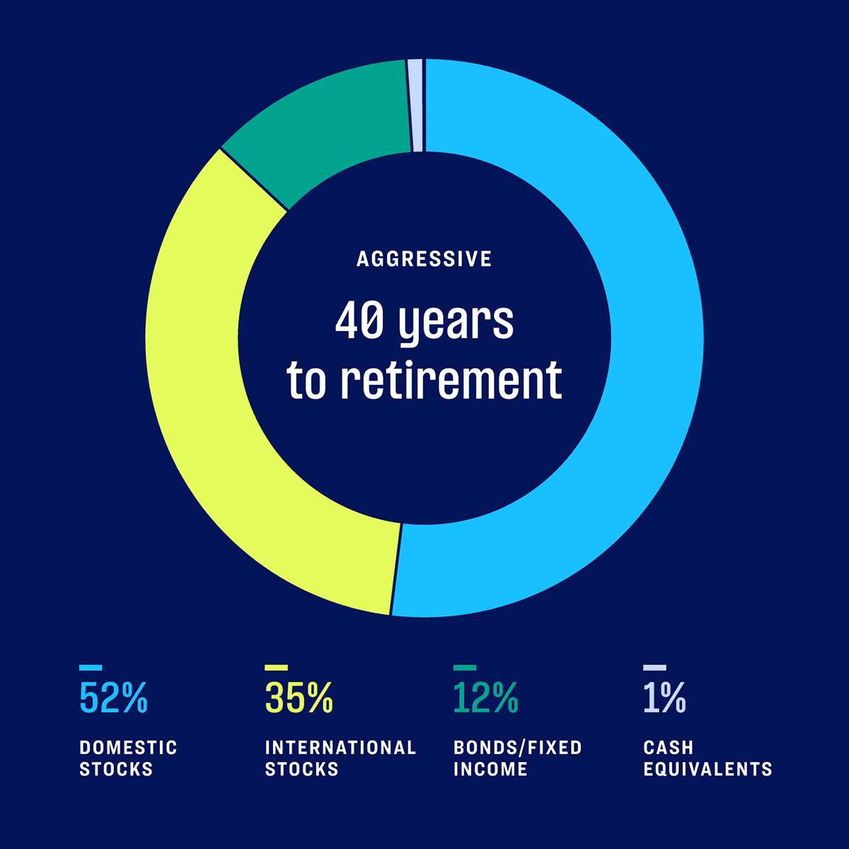
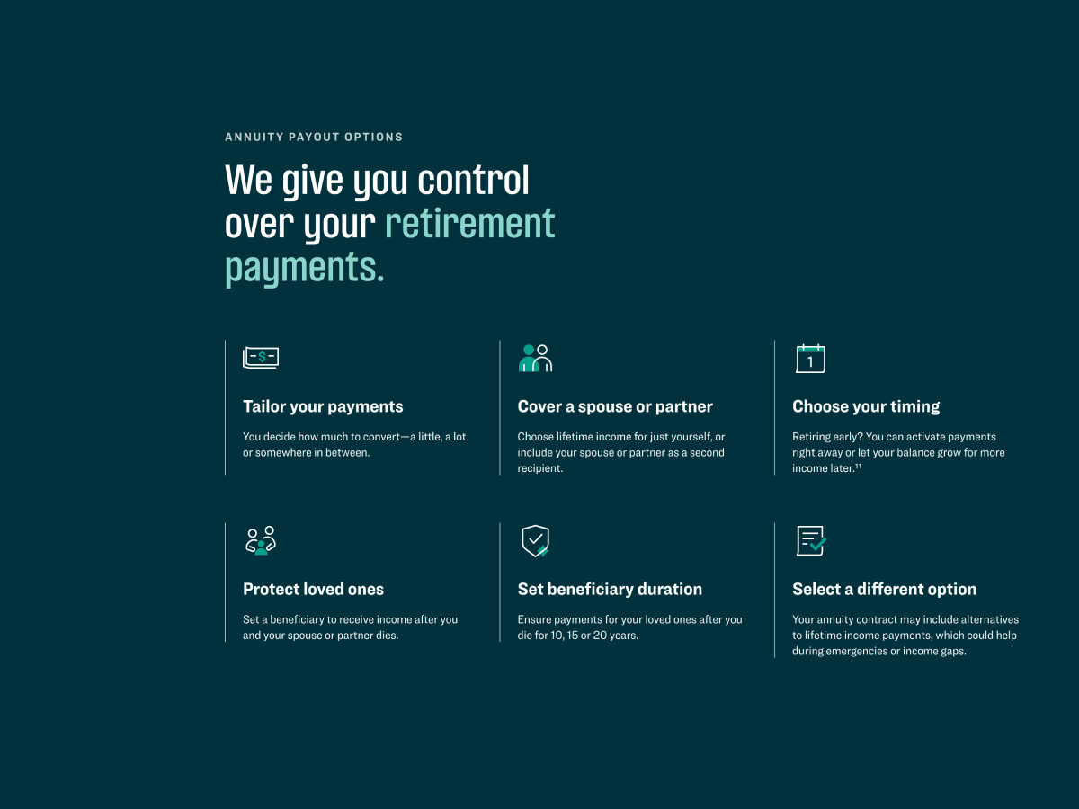
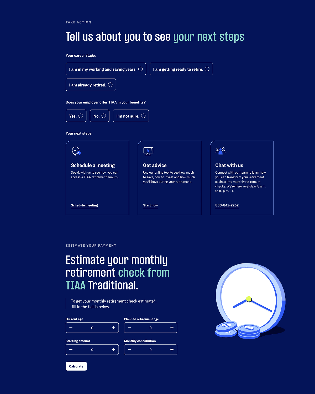
TIAA
,
Site
,
2024
TIAA has spent more than a century helping people achieve financial security, serving millions of educators, healthcare professionals, and public servants. Yet retirement planning—particularly annuities and lifetime income—remains complex, intimidating, and poorly understood by many of the people who need it most. As more households face the risk of outliving their savings, the challenge was not simply to modernize TIAA’s website, but to transform how people understand, engage with, and act on long-term financial decisions. The design of the refreshed experience focused on replacing fragmentation and overload with clarity, guidance, and trust. TIAA’s digital ecosystem was restructured around education rather than promotion—helping users meet the information at their own level, progress at their own pace, and understand not just what options exist, but how those choices could shape their future. Complexity was not removed, but translated: dense financial concepts were broken into interactive, digestible experiences that balanced rigor with approachability. A core focus was the Lifetime Income experience, where interactive educational flows, calculators, and data visualizations allowed users to model real retirement scenarios and understand the role annuities could play over time. By bringing data to life and emphasizing outcomes over jargon, the platform reframed TIAA as a long-term partner rather than a product provider—supporting confidence, informed decision-making, and sustained engagement. The resulting system significantly reduced redundancy across the site while improving discoverability, comprehension, and performance. Enrollment starts increased, engagement deepened, and the platform established a scalable foundation for future growth. More importantly, TIAA.com evolved into a trusted digital environment designed to help people navigate one of the most consequential decisions of their lives with clarity and confidence. - Credits: Jeremy Grant, Design Director Ryan Fan, Design Chaiun Oh, Design Ibrahim Noon, Motion
TIAA_01.mp4
TIAA_02.mp4
TIAA_03.mp4
TIAA_04.png
TIAA_05.png

TIAA_06.png
TIAA_07.png
TIAA_08.mp4

TIAA_09.png
TIAA_10.mp4
TIAA
,
Site
,
2024
TIAA has spent more than a century helping people achieve financial security, serving millions of educators, healthcare professionals, and public servants. Yet retirement planning—particularly annuities and lifetime income—remains complex, intimidating, and poorly understood by many of the people who need it most. As more households face the risk of outliving their savings, the challenge was not simply to modernize TIAA’s website, but to transform how people understand, engage with, and act on long-term financial decisions. The design of the refreshed experience focused on replacing fragmentation and overload with clarity, guidance, and trust. TIAA’s digital ecosystem was restructured around education rather than promotion—helping users meet the information at their own level, progress at their own pace, and understand not just what options exist, but how those choices could shape their future. Complexity was not removed, but translated: dense financial concepts were broken into interactive, digestible experiences that balanced rigor with approachability. A core focus was the Lifetime Income experience, where interactive educational flows, calculators, and data visualizations allowed users to model real retirement scenarios and understand the role annuities could play over time. By bringing data to life and emphasizing outcomes over jargon, the platform reframed TIAA as a long-term partner rather than a product provider—supporting confidence, informed decision-making, and sustained engagement. The resulting system significantly reduced redundancy across the site while improving discoverability, comprehension, and performance. Enrollment starts increased, engagement deepened, and the platform established a scalable foundation for future growth. More importantly, TIAA.com evolved into a trusted digital environment designed to help people navigate one of the most consequential decisions of their lives with clarity and confidence. - Credits: Jeremy Grant, Design Director Ryan Fan, Design Chaiun Oh, Design Ibrahim Noon, Motion
TIAA_01.mp4
TIAA_02.mp4
TIAA_03.mp4
TIAA_04.png
TIAA_05.png
TIAA_06.png
TIAA_07.png
TIAA_08.mp4
TIAA_09.png
TIAA_10.mp4
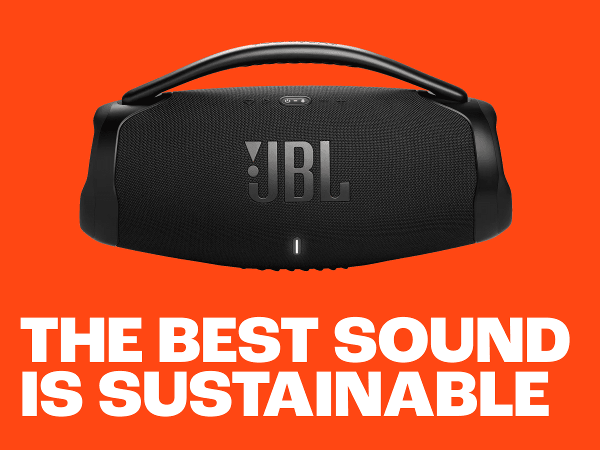
JBL
,
Brand Refresh
,
2023
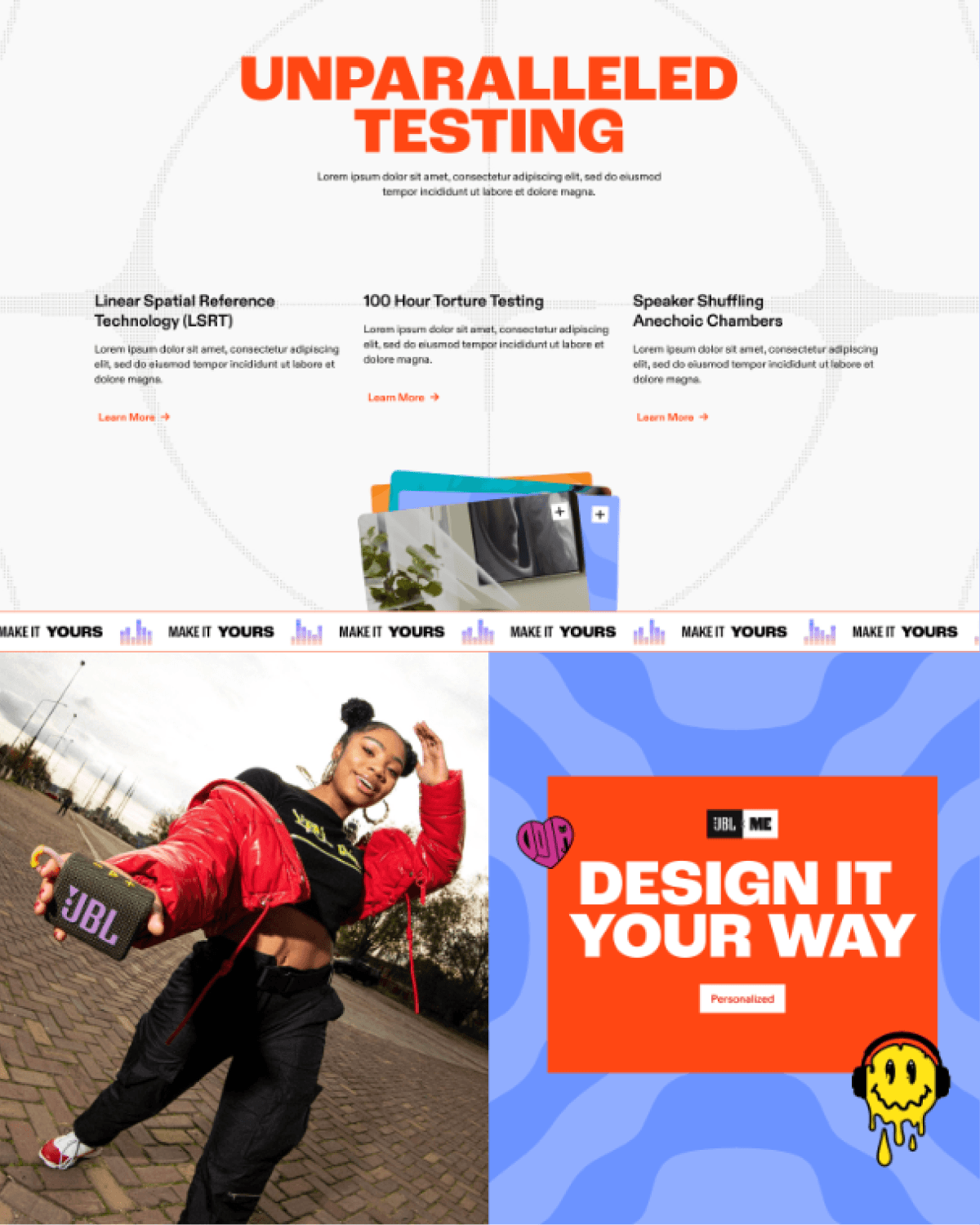
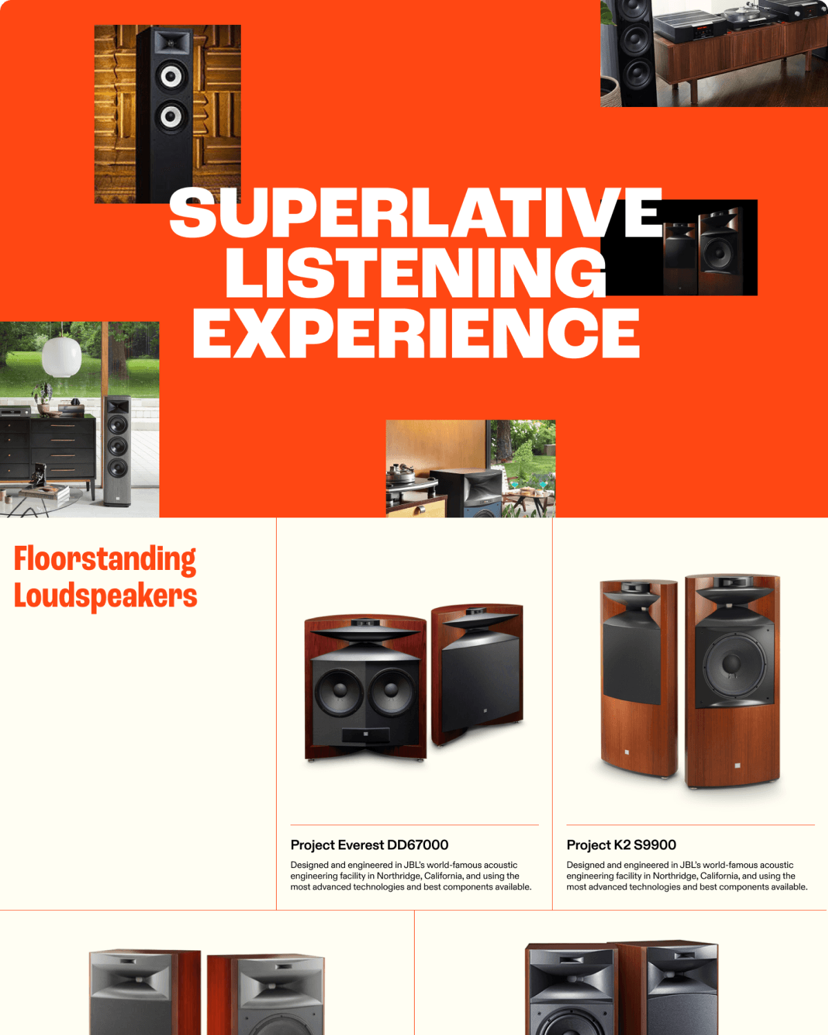
JBL is known for powerful sound, cultural relevance, and an expansive product portfolio—but its digital ecosystem struggled to reflect that strength with clarity or cohesion. The site emphasized transactions over exploration, presenting a vast catalog without guidance and fragmenting the brand across categories, regions, and interaction patterns. In a market where cheaper, highly rated alternatives are always within reach, the challenge was not awareness, but differentiation: how to express JBL’s authority in sound through a unified, confidence-building digital experience. I lead a team that focused on reframing jbl.com into a vibrant system of guided discovery—one that emphasized relevance, hierarchy, and long-term relationships over volume alone. Structural issues were addressed through a standardized design language that could scale globally while remaining grounded in JBL’s core brand ethos, bringing consistency to navigation, components, and interaction patterns without flattening expression. A defining innovation was the introduction of a sound-driven, cymatics-based algorithm used to generate the visual system itself. By translating audio frequencies into graphic form and motion, sound became the organizing logic of the experience rather than a metaphor layered on top. This approach reinforced JBL’s engineering-led identity while enabling a cohesive visual spectrum adaptable across products, content, and regions. The resulting platform balanced performance with expression—clarifying choice, encouraging exploration, and aligning the digital experience with the precision and power of the products themselves. In doing so, JBL’s site evolved into a unified brand environment designed to support direct relationships, ecosystem growth, and long-term relevance. - Credits: Jeremy Grant, Design Director Tammy Hsieh, Design Sanchi Oberoi, Design Ibrahim Noon, Design
JBL_01.png
JBL_02.png
JBL_03.png
JBL_04.mp4
JBL_05.mp4
JBL_06.mp4
JBL_07.mp4
JBL_08.png
JBL_09.mp4
JBL_10.png
JBL
,
Brand Refresh
,
2023
JBL is known for powerful sound, cultural relevance, and an expansive product portfolio—but its digital ecosystem struggled to reflect that strength with clarity or cohesion. The site emphasized transactions over exploration, presenting a vast catalog without guidance and fragmenting the brand across categories, regions, and interaction patterns. In a market where cheaper, highly rated alternatives are always within reach, the challenge was not awareness, but differentiation: how to express JBL’s authority in sound through a unified, confidence-building digital experience. I lead a team that focused on reframing jbl.com into a vibrant system of guided discovery—one that emphasized relevance, hierarchy, and long-term relationships over volume alone. Structural issues were addressed through a standardized design language that could scale globally while remaining grounded in JBL’s core brand ethos, bringing consistency to navigation, components, and interaction patterns without flattening expression. A defining innovation was the introduction of a sound-driven, cymatics-based algorithm used to generate the visual system itself. By translating audio frequencies into graphic form and motion, sound became the organizing logic of the experience rather than a metaphor layered on top. This approach reinforced JBL’s engineering-led identity while enabling a cohesive visual spectrum adaptable across products, content, and regions. The resulting platform balanced performance with expression—clarifying choice, encouraging exploration, and aligning the digital experience with the precision and power of the products themselves. In doing so, JBL’s site evolved into a unified brand environment designed to support direct relationships, ecosystem growth, and long-term relevance. - Credits: Jeremy Grant, Design Director Tammy Hsieh, Design Sanchi Oberoi, Design Ibrahim Noon, Design
JBL_01.png
JBL_02.png
JBL_03.png
JBL_04.mp4
JBL_05.mp4
JBL_06.mp4
JBL_07.mp4
JBL_08.png
JBL_09.mp4
JBL_10.png
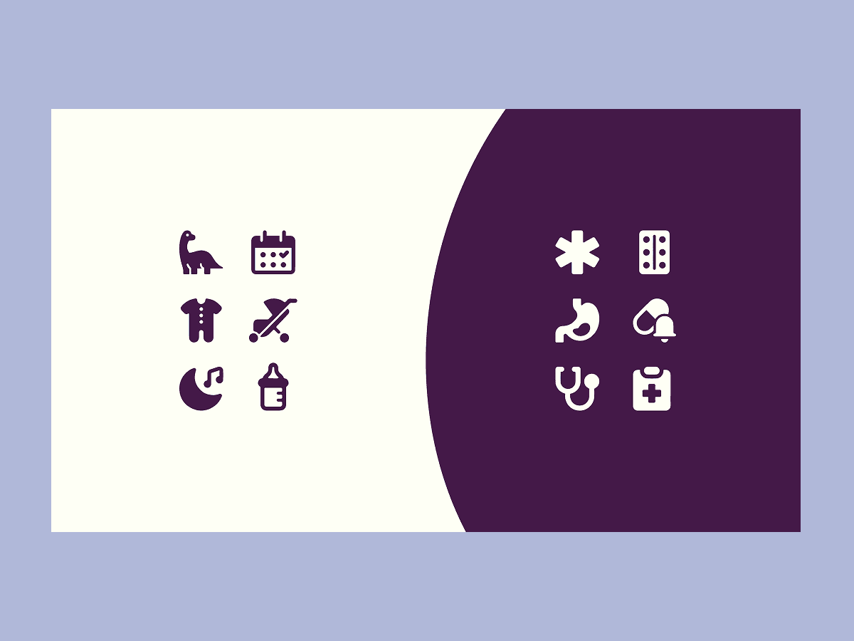
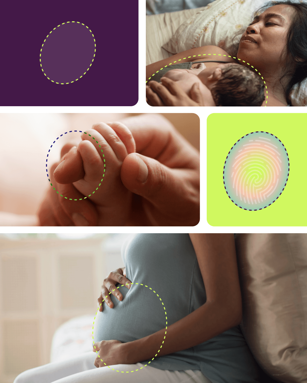
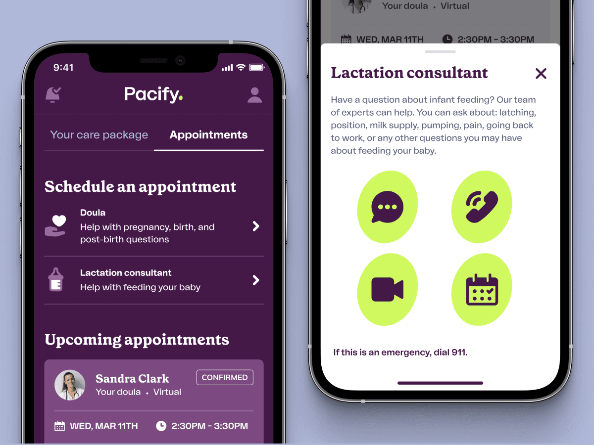
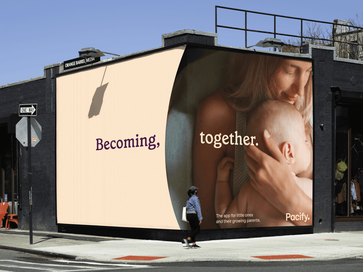
Pacify
,
App
,
2025
Pacify supports parents through one of life’s most profound—and often disorienting—transitions. By providing on-demand access to nurses, lactation consultants, and care professionals, the platform plays a critical role in helping families feel informed and supported from pregnancy through early parenthood. As Pacify prepared to expand beyond its B2B foundation into a direct-to-consumer offering, the challenge was not simply growth, but translation: how to meet parents with clarity and care at moments that are emotionally charged, deeply personal, and constantly changing. At the center of the work was a simple insight: a child is in a state of continuous transformation—even before birth—and to support that change, a parent must transform as well. Leading the brand and product redesign, I helped reframe Pacify not as a utility, but as a steady companion—one designed to evolve in parallel with the families it serves. This philosophy informed every layer of the system, from messaging and visual language to product interactions and service touchpoints. The resulting experience emphasized warmth, adaptability, and reassurance without sacrificing clarity or scale. By meeting parents where they were—emotionally and practically—the platform delivered guidance when it mattered most, while establishing a durable foundation for growth. Pacify emerged as a trusted, human presence in moments of uncertainty, designed to support both immediate needs and long-term care journeys. - Credits: Jeremy Grant, Design Director Roman Koscianki, Design David Dorsey, Motion Bryn Dodson, Copy Director Steve Pirani, Copy
Pacify_01.png
Pacify_02.png
Pacify_03.mp4
Pacify_04.png
Pacify_05.mp4

Pacify_06.png
Pacify_07.mp4
Pacify_08.png
Pacify_09.png
Pacify_10.mp4
Pacify
,
App
,
2025
Pacify supports parents through one of life’s most profound—and often disorienting—transitions. By providing on-demand access to nurses, lactation consultants, and care professionals, the platform plays a critical role in helping families feel informed and supported from pregnancy through early parenthood. As Pacify prepared to expand beyond its B2B foundation into a direct-to-consumer offering, the challenge was not simply growth, but translation: how to meet parents with clarity and care at moments that are emotionally charged, deeply personal, and constantly changing. At the center of the work was a simple insight: a child is in a state of continuous transformation—even before birth—and to support that change, a parent must transform as well. Leading the brand and product redesign, I helped reframe Pacify not as a utility, but as a steady companion—one designed to evolve in parallel with the families it serves. This philosophy informed every layer of the system, from messaging and visual language to product interactions and service touchpoints. The resulting experience emphasized warmth, adaptability, and reassurance without sacrificing clarity or scale. By meeting parents where they were—emotionally and practically—the platform delivered guidance when it mattered most, while establishing a durable foundation for growth. Pacify emerged as a trusted, human presence in moments of uncertainty, designed to support both immediate needs and long-term care journeys. - Credits: Jeremy Grant, Design Director Roman Koscianki, Design David Dorsey, Motion Bryn Dodson, Copy Director Steve Pirani, Copy
Pacify_01.png
Pacify_02.png
Pacify_03.mp4
Pacify_04.png
Pacify_05.mp4
Pacify_06.png
Pacify_07.mp4
Pacify_08.png
Pacify_09.png
Pacify_10.mp4
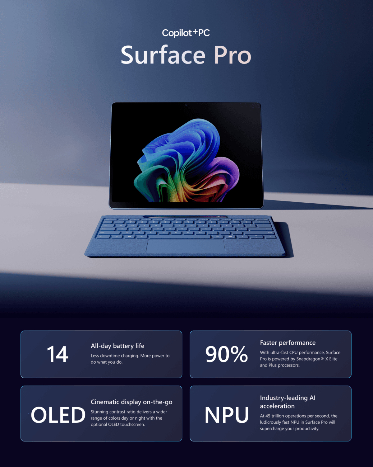
Microsoft Copilot+PC
,
Site
,
2024
Microsoft introduced Copilot+ PCs as a new category of AI-driven computing—devices designed to be adaptive, context-aware, and deeply integrated into everyday work. The digital experience supporting the launch needed to do more than showcase hardware; it had to communicate a shift in how personal computing works, translating Microsoft’s evolving AI vision into something legible, intuitive, and credible at scale. Working on the launch of the next-generation Surface lineup, I helped shape a modular digital system that balanced clarity with flexibility—one capable of expressing intelligence without overwhelming users. The experience was designed to guide exploration rather than present information flatly, using structure, motion, and responsive storytelling to reveal capabilities progressively and in context. Rather than positioning AI as a feature set, the system framed it as an ambient layer supporting productivity, creativity, and flow. The resulting framework scaled seamlessly across surfaces and touchpoints, providing Microsoft with a future-proof foundation for introducing AI-powered devices. More than a single launch moment, the work established a new model for how Microsoft communicates innovation—grounding advanced technology in clear interaction patterns and a cohesive, durable digital language. - Credits: Jeremy Grant, Design Director Rima Massasati, Design Ken Inoue, Design Ibrahim Noon, Motion Buck, 3D
Copilot+PC_01.mp4
Copilot+PC.mp4
Copilot+PC.mp4
Copilot+PC.mp4
Copilot+PC.png
Copilot+PC.mp4
Copilot+PC.mp4
Copilot+PC.mp4

Copilot+PC.png
Copilot+PC.mp4
Microsoft Copilot+PC
,
Site
,
2024
Microsoft introduced Copilot+ PCs as a new category of AI-driven computing—devices designed to be adaptive, context-aware, and deeply integrated into everyday work. The digital experience supporting the launch needed to do more than showcase hardware; it had to communicate a shift in how personal computing works, translating Microsoft’s evolving AI vision into something legible, intuitive, and credible at scale. Working on the launch of the next-generation Surface lineup, I helped shape a modular digital system that balanced clarity with flexibility—one capable of expressing intelligence without overwhelming users. The experience was designed to guide exploration rather than present information flatly, using structure, motion, and responsive storytelling to reveal capabilities progressively and in context. Rather than positioning AI as a feature set, the system framed it as an ambient layer supporting productivity, creativity, and flow. The resulting framework scaled seamlessly across surfaces and touchpoints, providing Microsoft with a future-proof foundation for introducing AI-powered devices. More than a single launch moment, the work established a new model for how Microsoft communicates innovation—grounding advanced technology in clear interaction patterns and a cohesive, durable digital language. - Credits: Jeremy Grant, Design Director Rima Massasati, Design Ken Inoue, Design Ibrahim Noon, Motion Buck, 3D
Copilot+PC_01.mp4
Copilot+PC.mp4
Copilot+PC.mp4
Copilot+PC.mp4
Copilot+PC.png
Copilot+PC.mp4
Copilot+PC.mp4
Copilot+PC.mp4
Copilot+PC.png
Copilot+PC.mp4